Fiction Novel Type-setting/Interior Layout: Worm
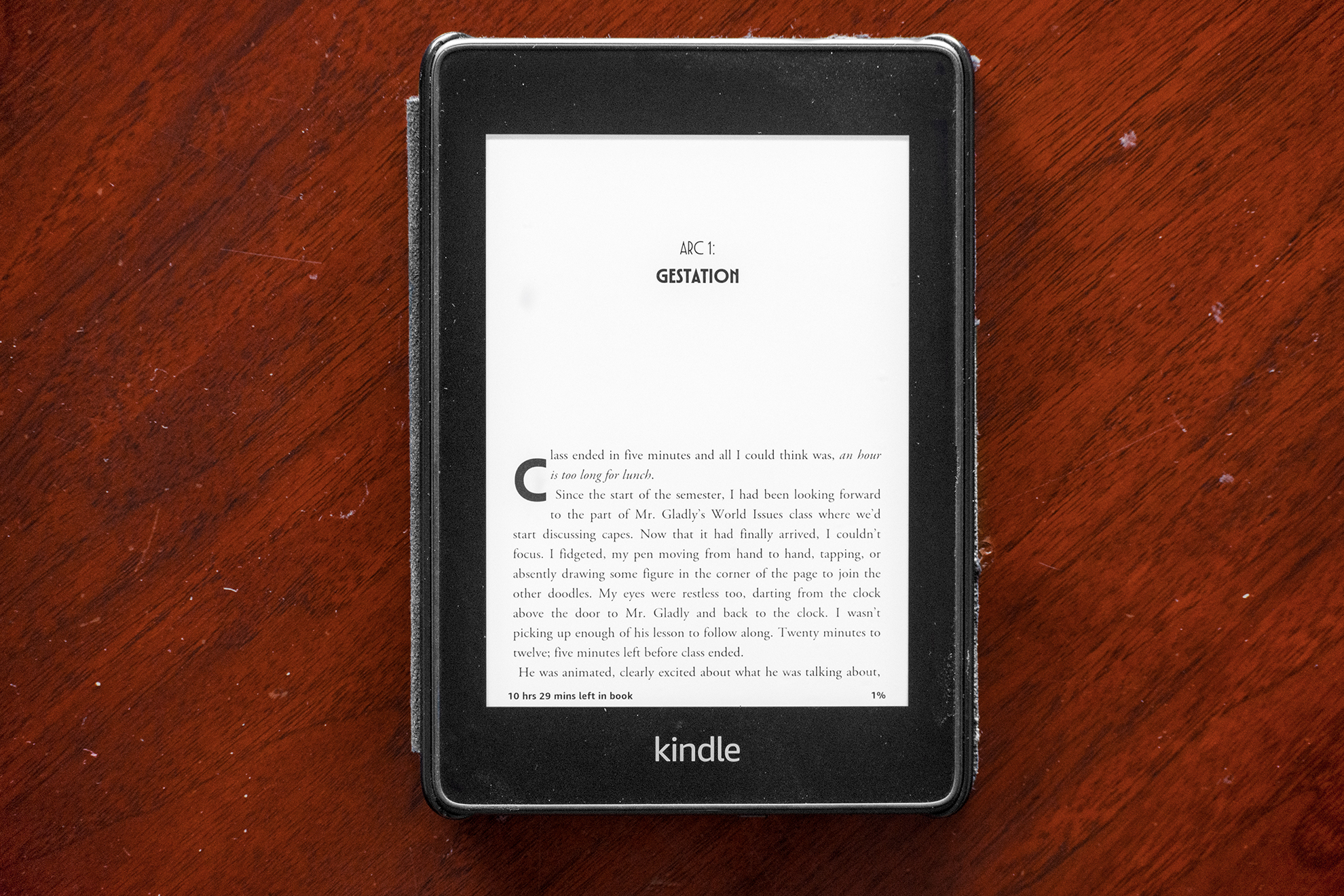
Worm is a first-person superhero epic by John C. “Wildbow” McCrae following Taylor, a highschool girl with the power to control bugs and other simple life-forms. It was self-published online serially from 2011-2013, concluding with a final word count of almost 1.7 million and reaching a readership of hundreds of thousands. As a personal project to learn and practice interior design, or typesetting, I decided to bring this never-published-in-print serial — and dear to me story that I have read “cover” to “cover” multiple times — to life.
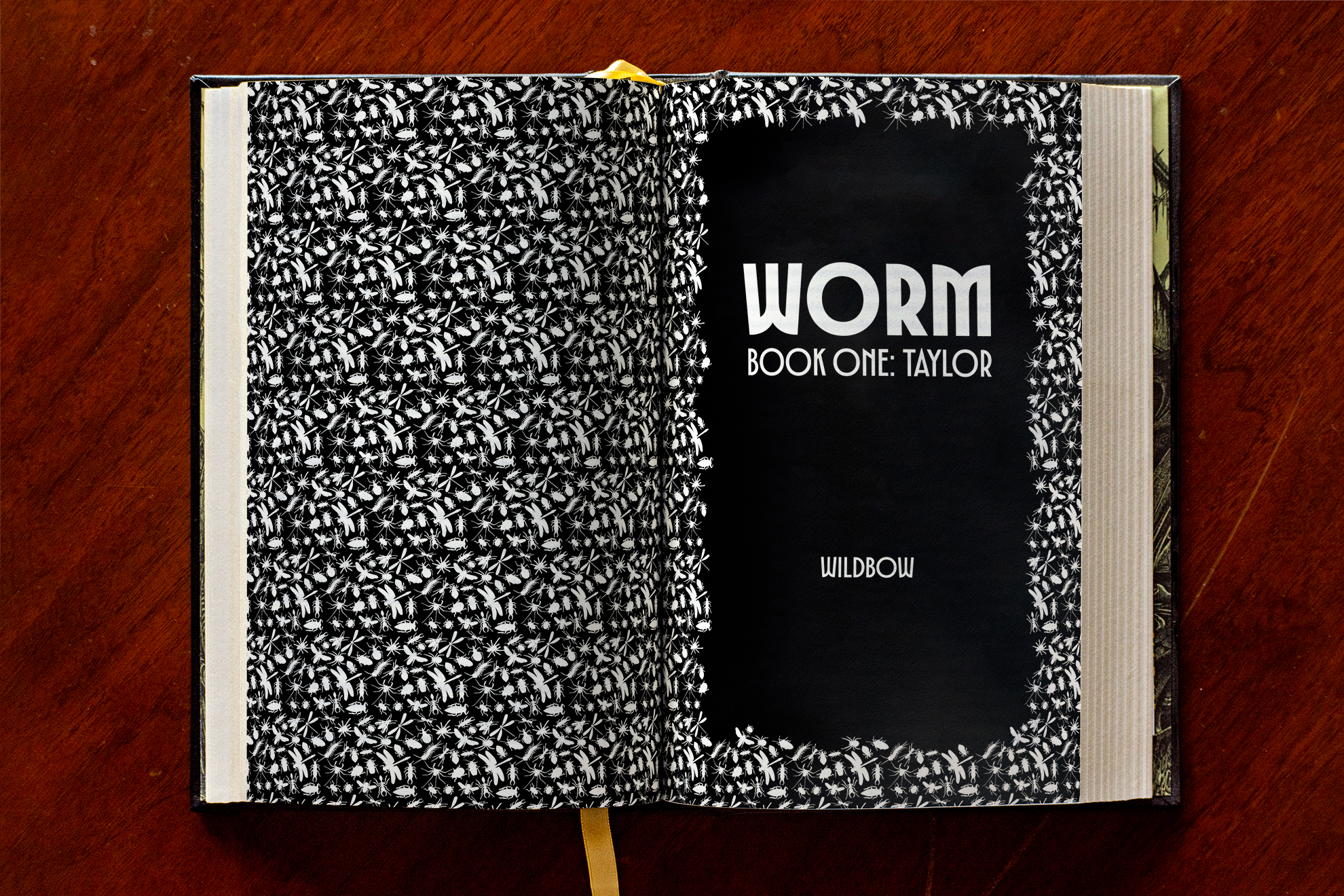
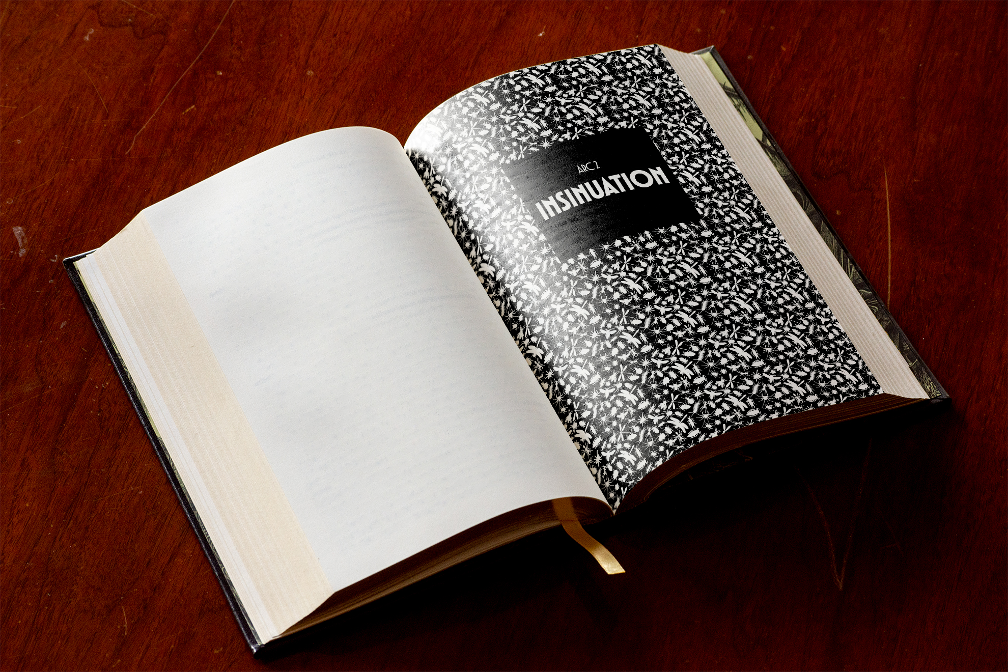
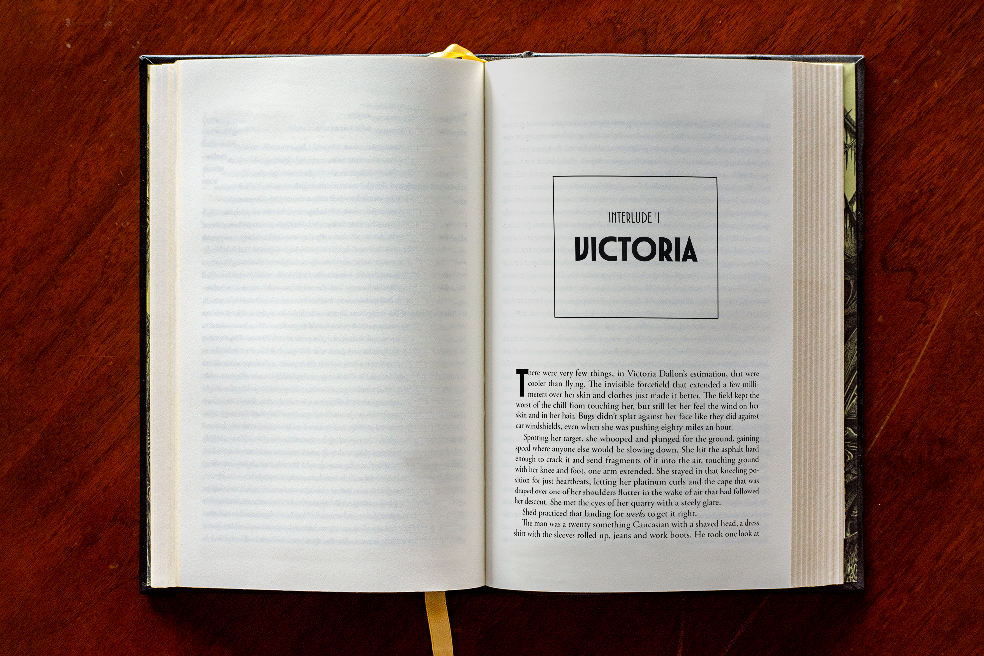
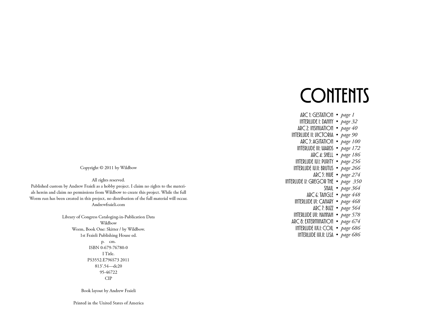
First, I decided how to split the series up. It was originally published in 30 “arcs” with multiple “interludes” between each, and each “arc” broken up into sections. Across “arcs” are story arcs within themselves which I used as the basis to break the serial up into five books — each about eight “arcs” long — titled by the various names the main character takes across the series: Taylor, Skitter, Warlord, Weaver, and Khepri. Chapters are represented by the “arcs” with custom cockroach bullets separating the author’s originally published sections.
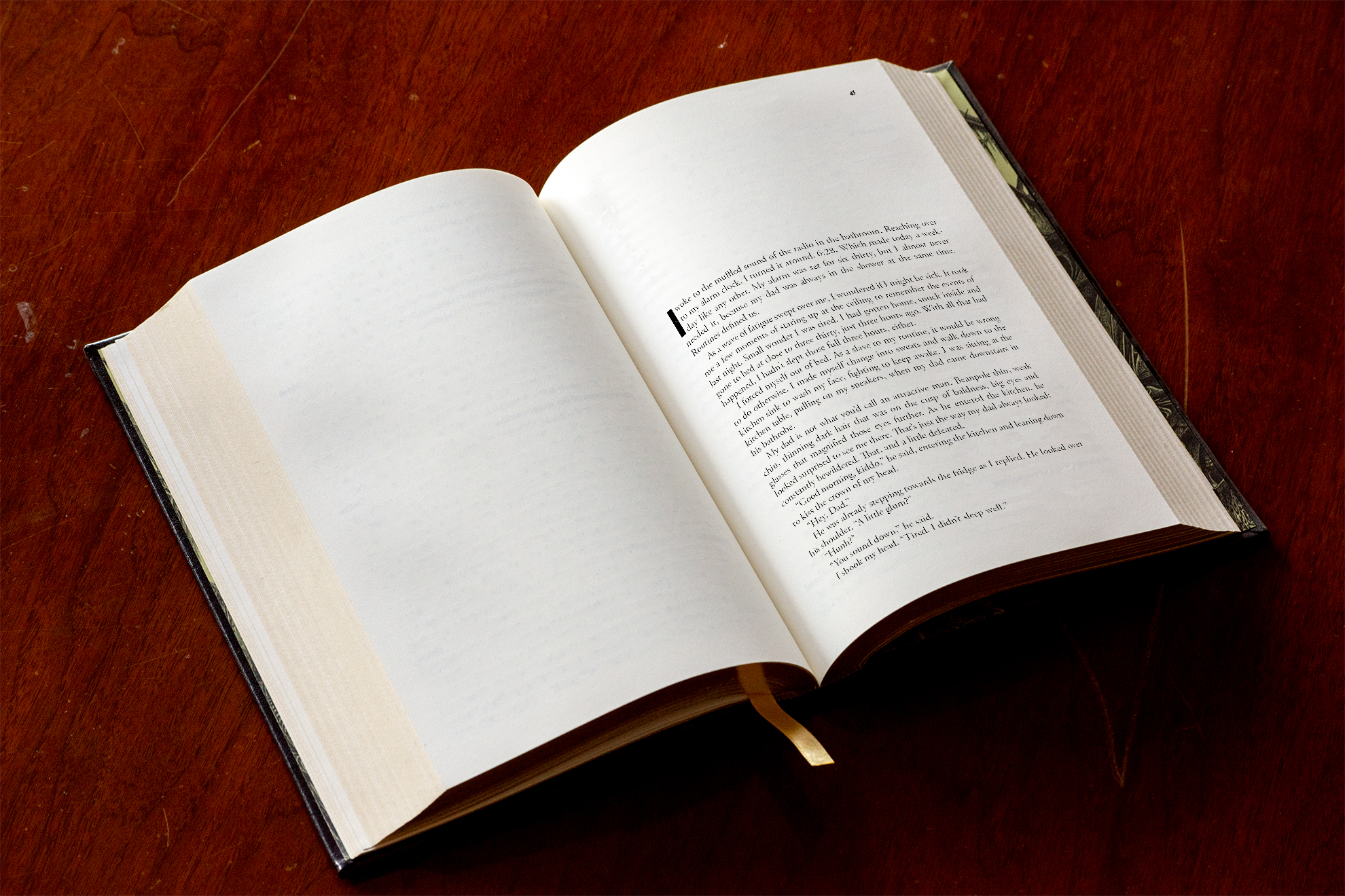
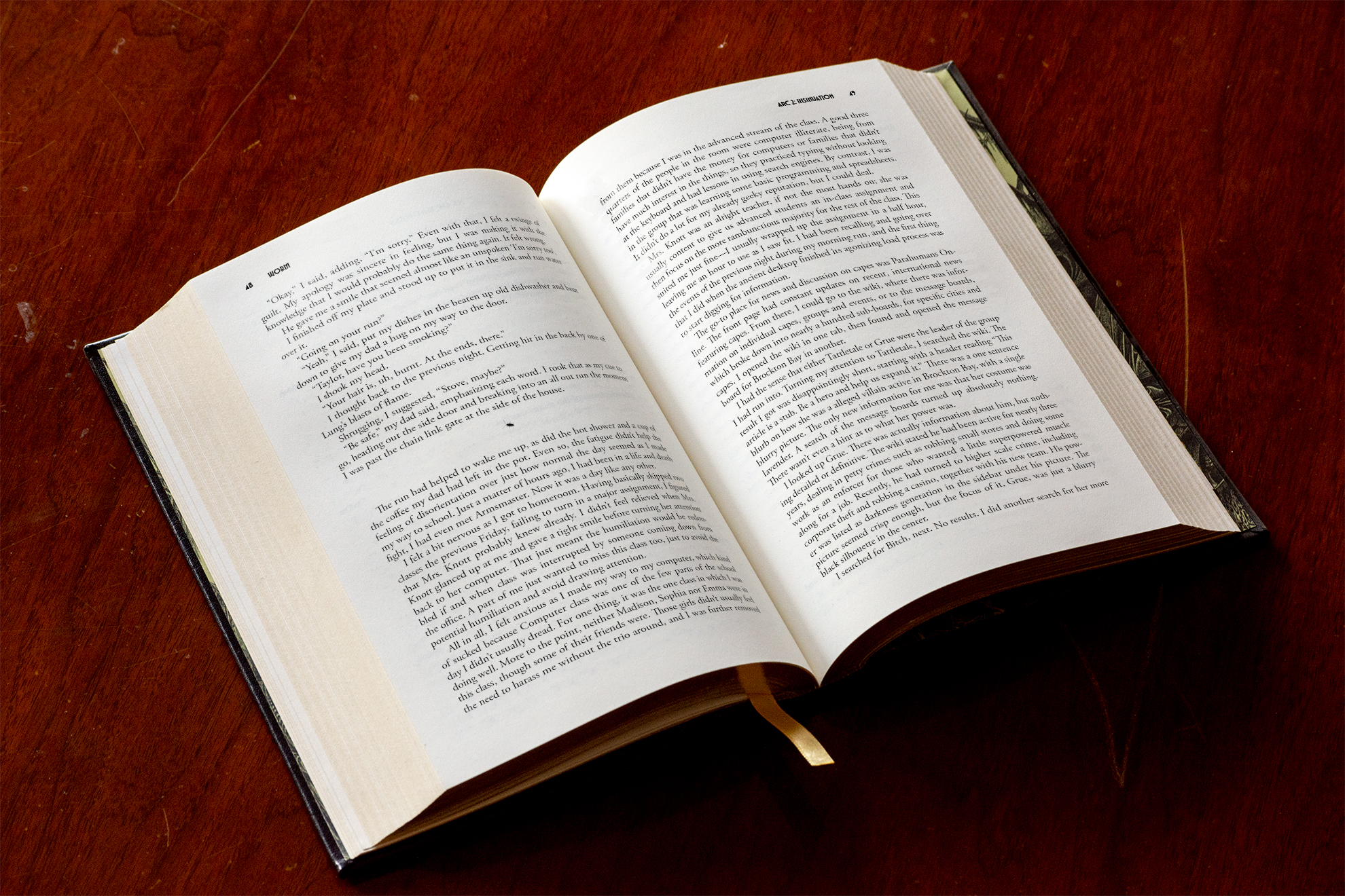
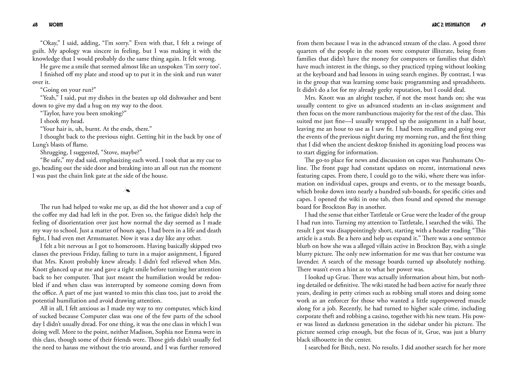
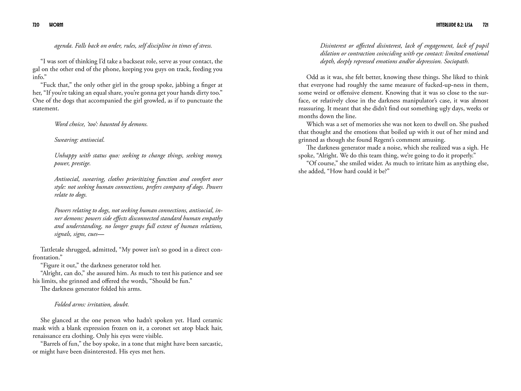
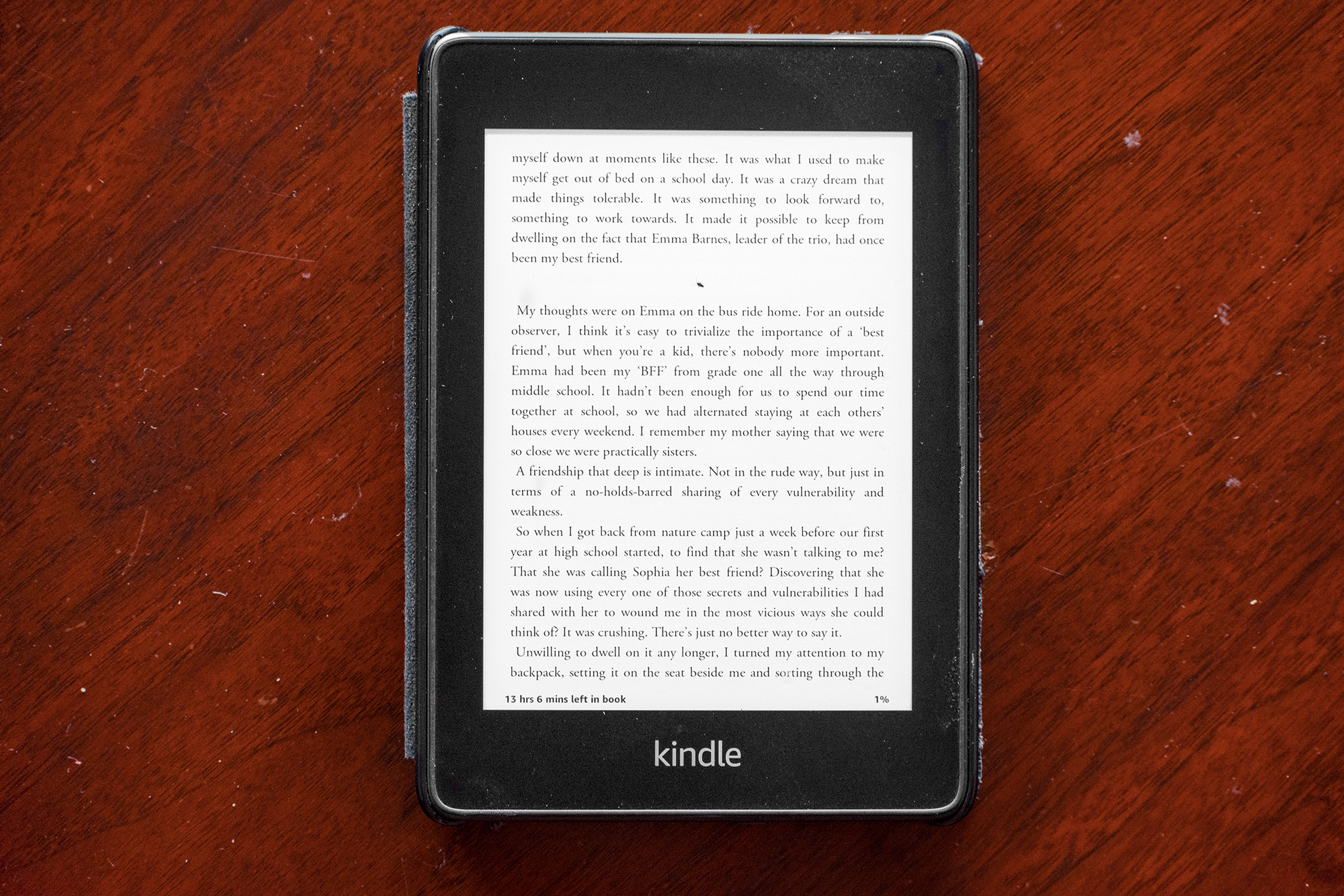
With the length of the series, I knew each book would stretch even fantasy length, so I chose 6″x9″ hardcover as the industry standard size to use. In the end it came out to about 700 pages through setting the book font (Adobe Garamond Pro for legibility and a classic look) to 11pt with 13pt spacing giving 40 lines per page and around 500 words. To give breathing space for the reader’s eyes and adequate binding and printing space, I set the top margin to 0.5 in, bottom and outside to 0.75 in and inside to 0.875 in. I chose the font for the headers, titles and most of the front matter as TT Modernoir for its art deco feel, matching the golden age of superheroes that Worm tries to recreate, along with the dark of such a world.
The beginnings of “Arcs” and “Interludes” were given unique chapter pages to separate the two types from each other, continuing the title page’s bug theme.
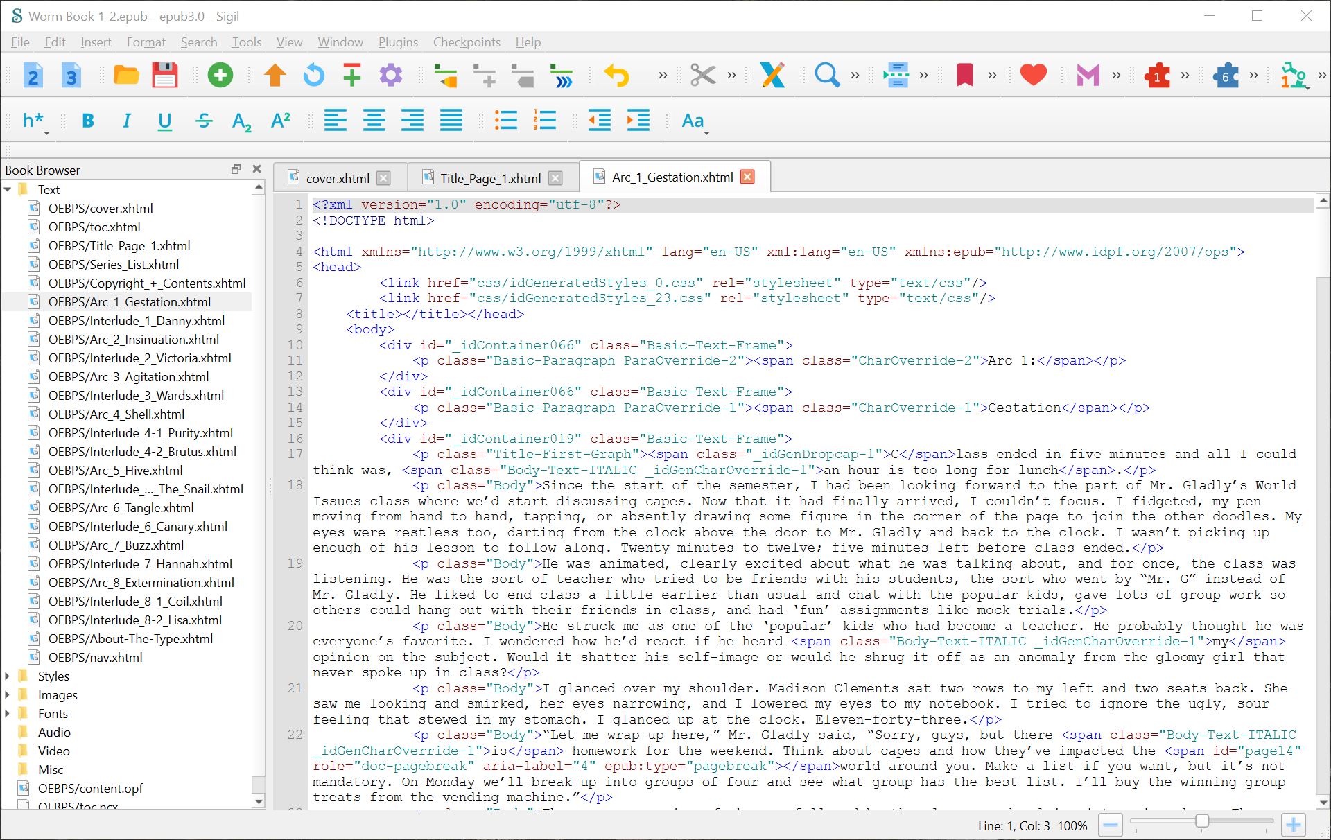
Next, I acquired a crudely made EPUB containing the series broken up by “arc” and “interlude” including the author’s original formatting like italic emphasis and indenting for computer screen text or internal thoughts. I created a Word document from the EPUB and changed all italics to an italic styling instead of font-specific, allowing me to export and place this text into Indesign and adapt into an Indesign charactor style without losing any of the author’s original formatting.
All text within the book is set by paragraph and character styles to be consistent and allow efficient design changes and updates, including all spacing — there are no doubled hard or soft breaks. Each “arc” and “interlude” is saved as a separate Indesign document managed by an Indesign Book file. The front matter includes an initial title page, series list, secondary title page, matching copyright page and contents page, and numbered with roman numerals with the first “arc” title page constituting page 1. I also aligned all text to a grid to keep lines consistently even.
In addition to typesetting the serial, I also designed a reflowable EPUB.
Exporting initially from InDesign, I edited the EPUB in Sigil — an open-source EPUB editor — modifying, fixing and simplifying CSS and HTML consistency and formatting issues.
Retro MTV Logo
Using Illustrator to create a vector, and Photoshop to create the neon, I then imported into After Effects and customized a set of effects to give the look of color dissociation, tape defects, and playback stutter.

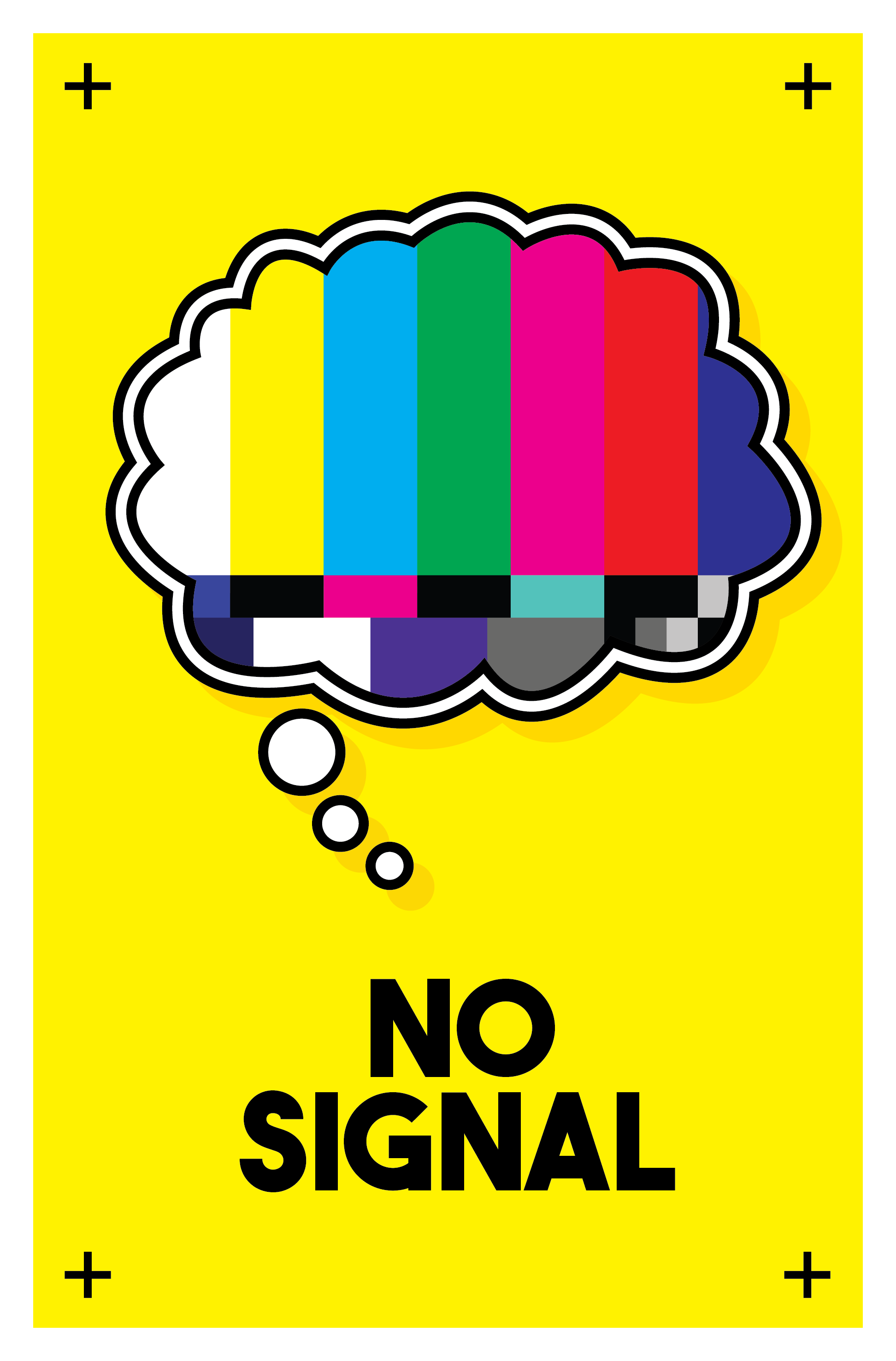
No Signal
Made in Illustrator
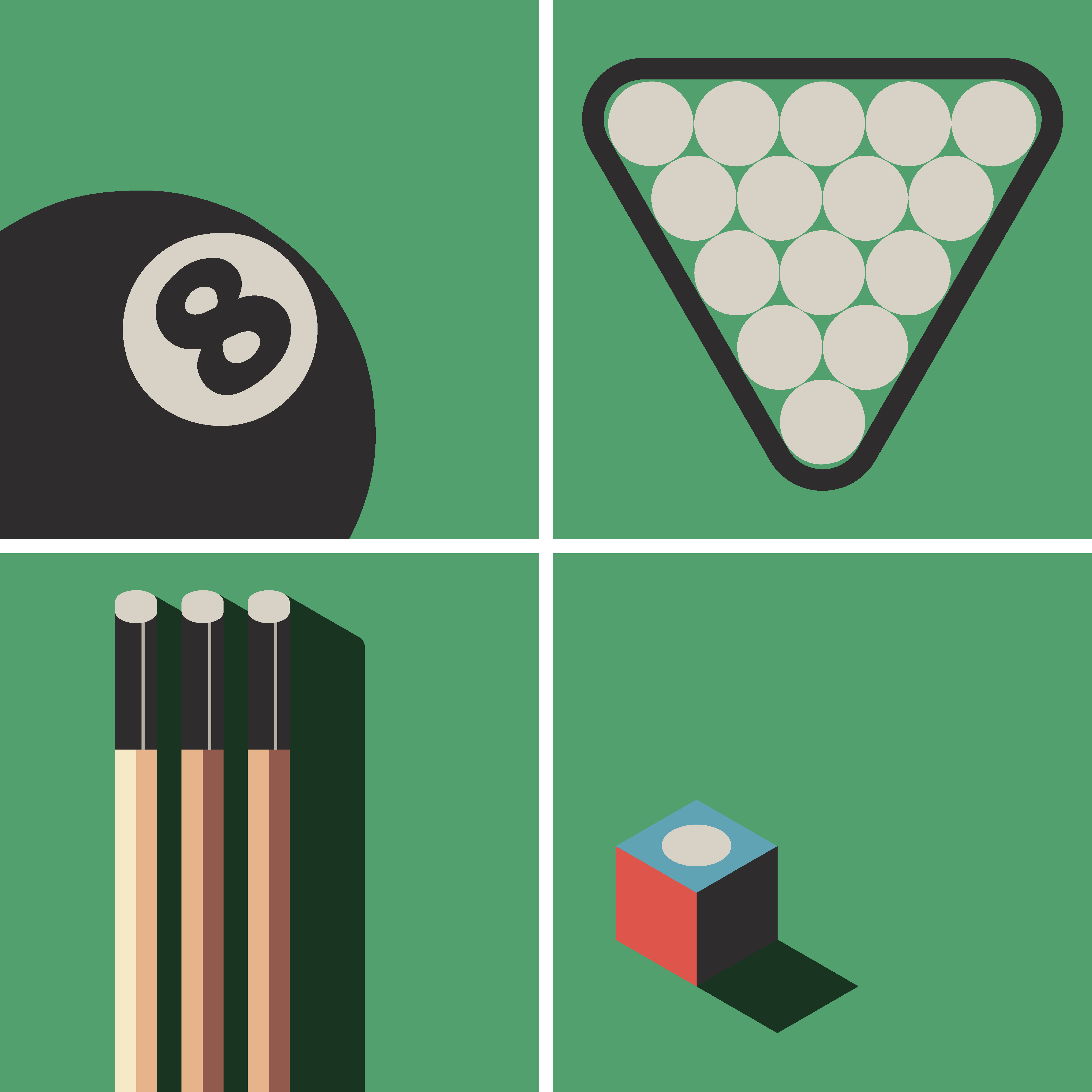
Billiards
A stylistic rendering of billiards based on the cover of a 1950s miniature billiards set. Made in Illustrator.
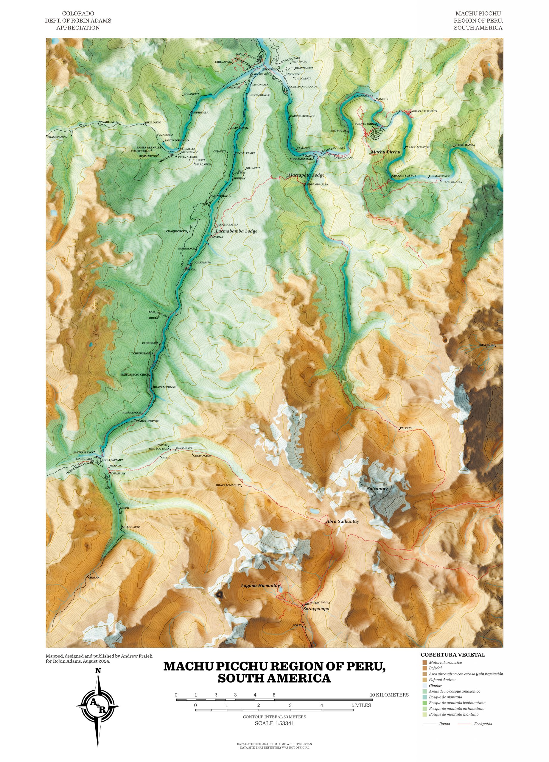
Map of Machu Picchu
A map of the Machu Picchu region of Peru I created from scratch using QGIS to lay out GIS data, Illustrator for some details, and Blender to create a 3D map of the height data, based roughly on the style of 1950s Adirondacks hiking maps.
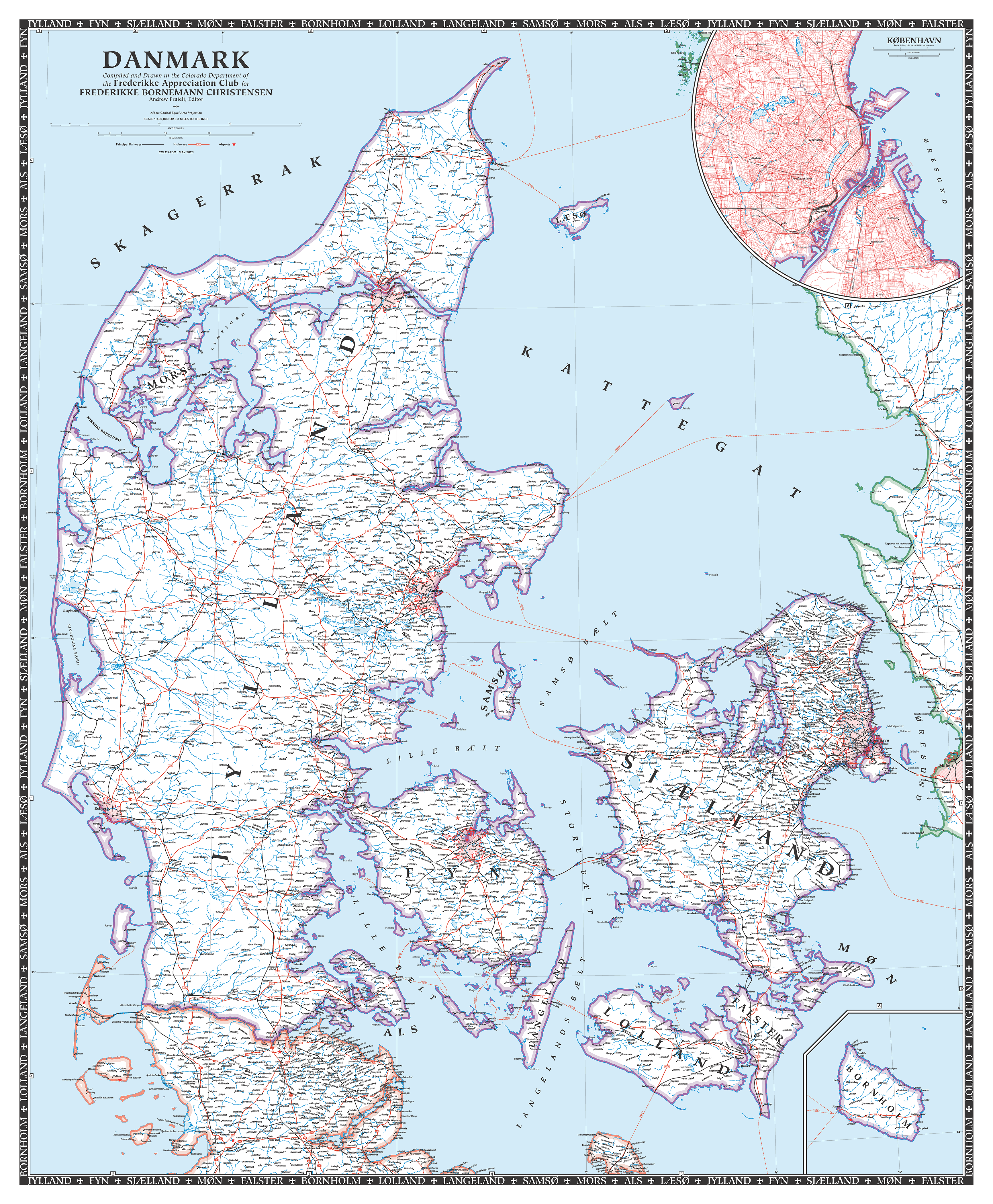
Map of Denmark
A map of Denmark I created from scratch using QGIS and Illustrator based on the design of old National Geographic maps of the United States from the 40s and 50s.
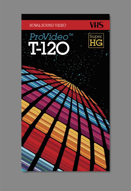
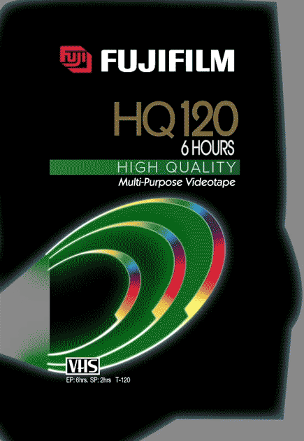
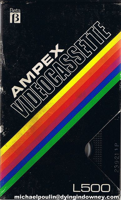
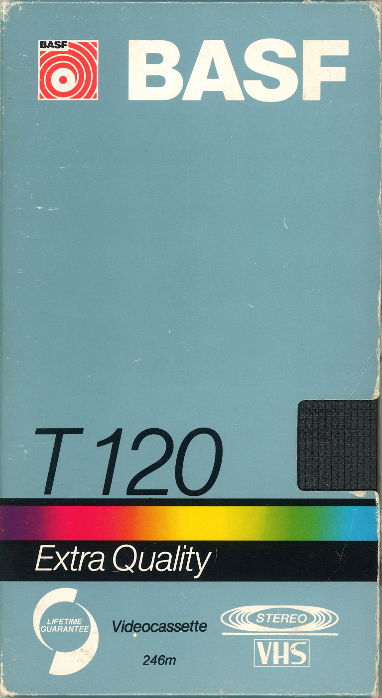
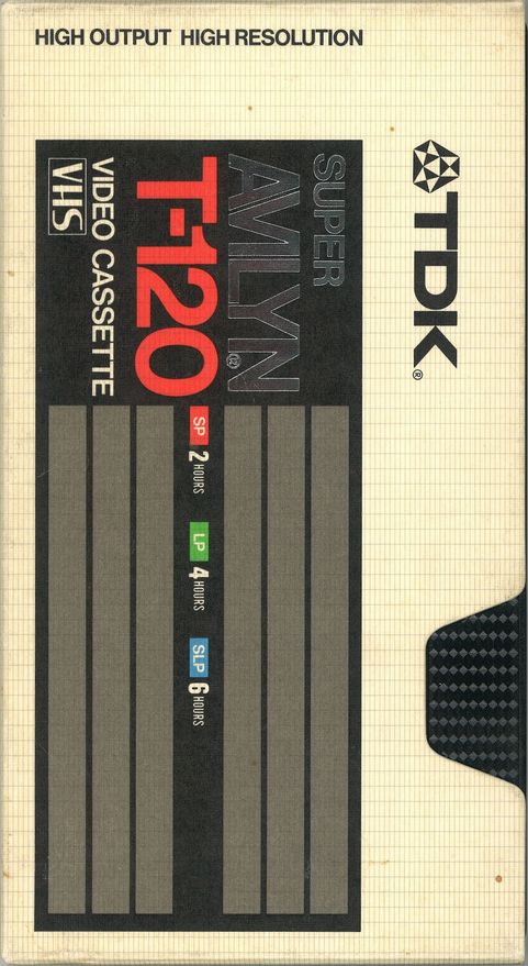
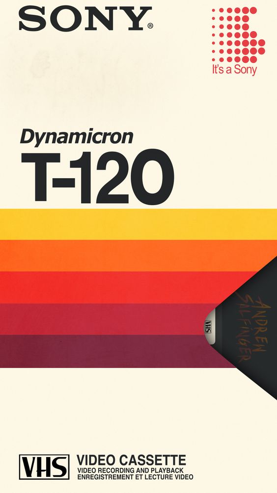
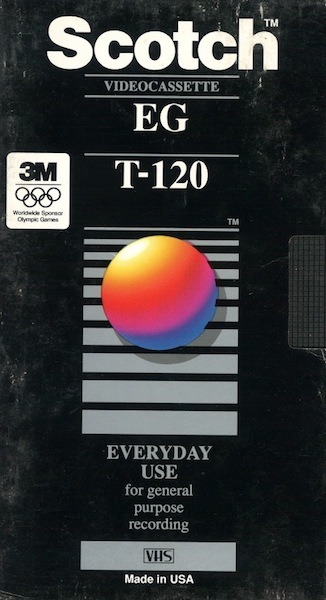
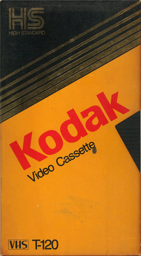
VHS Box Designs
I find VHS tape boxes fascinating in their designs. As a challenge, I recreated some of them in purely Illustrator using only vectors and live text. They are all scalable, customizable vectors.
A few of them I photoshopped into worn boxes to bring it full circle.